
Trademark Meaning

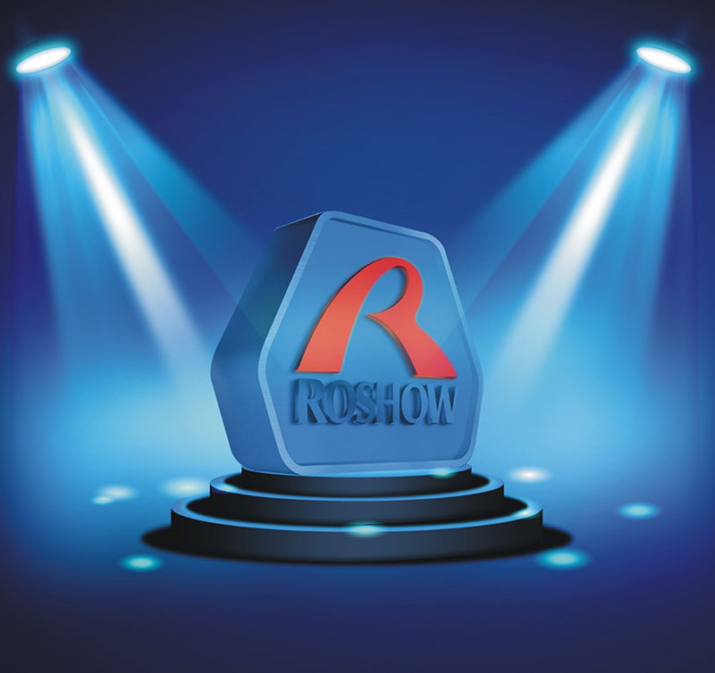
The shape is similar to diamond, representing company’s solid foundation and excellent product quality.
1It develops from “ROSHOW” first letter R, which has strong legibility and readability;
2The logo is similar to Chinese characters “Ren”, which is consistent with Roshow’s people-oriented concept.
3The logo is like a red ribbon dancing in the wind, which symbolizes the happy mood of Roshow to meet success
4The logo is like erect big toe, demonstrating Roshow’s deternimation and courage to be No.1
Logo Explanation
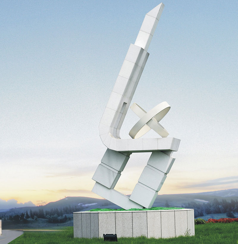
The logo is similar to a rocket on a launch pad and reveals the theme of development. Development is the pursuit of Roshow. In order to keep catch with the times and compete in the global market, Roshow needs development. Development is Roshow’s basic direction. Roshow must achieves rapid development in order to survive in the fast fish eat slow fish market competition.
The logo is white, representing staunch, which shows that Roshow is loyal to their customers and always pay attention to customer satisfaction; The white represents pure, beautiful and peaceful, which expresses Roshow’s desire to create a harmonious enterprise, and a better developmental environment.
Logo’s design adopts two graphics of square, circle, which takes the meaning of wise saying “there are no shapes if no rules” and reveals the iron law that “operating enterprise must have rules, understand rules and obey it. Besides, “round outside and square inside” represents Roshow’s rightful, canonical, pliable and flexible acting style and management concepts of “ building the enterprise with good faith and seeking win-win cooperation”.
Element 1 A solid octagon square represents eight career foundations supporting Roshow, which is Roshow culture, talents, technology, brand, management, innovation ability, capital operation and high-end market.
Element 2 The design refers to jade appearance. Jade is the ancient ritual used for sacrificing heaven and earth, representing status and wealth, which symbolizes Roshow’s advantages in material and spiritual wealth and occupies the leading position in the industry. Element 2 is similar with the motor winding, representing company’s pillar industry --- Manufacture and sale of enameled wire products.
Element 3 is composed of Crossed two X Roulette , similar to the earth. Roulette represents another pillar industry--- Turbocharger design, manufacture and sales; The earth symbolizes that Roshow’s management has entered into the orbit of Globalization.
Element 4 is the Chinese phonetic alphabet L deformation and constitutes the abbreviation of phonetic alphabet LX when combines with 3. The combination figure is similar to number “100”, which symbolizes Roshow’s ambition and courage to enter into the nation's top 100 manufacturing enterprises and build a world-class strong enterprises.


 Home >


